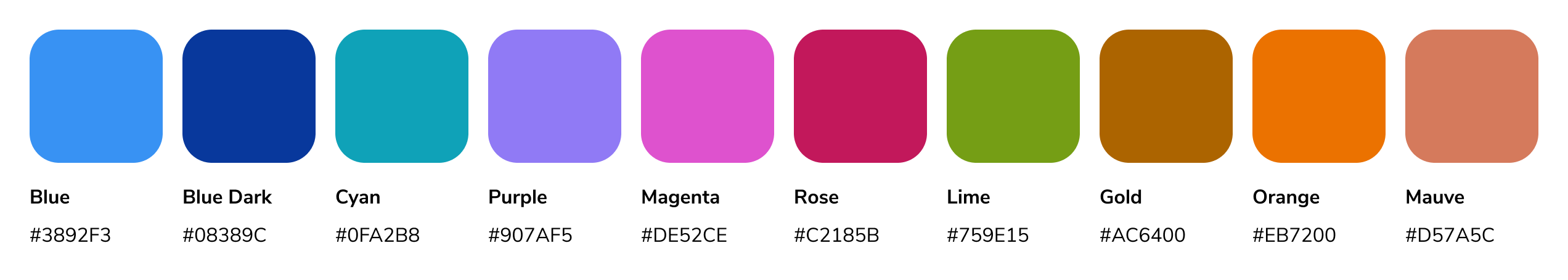
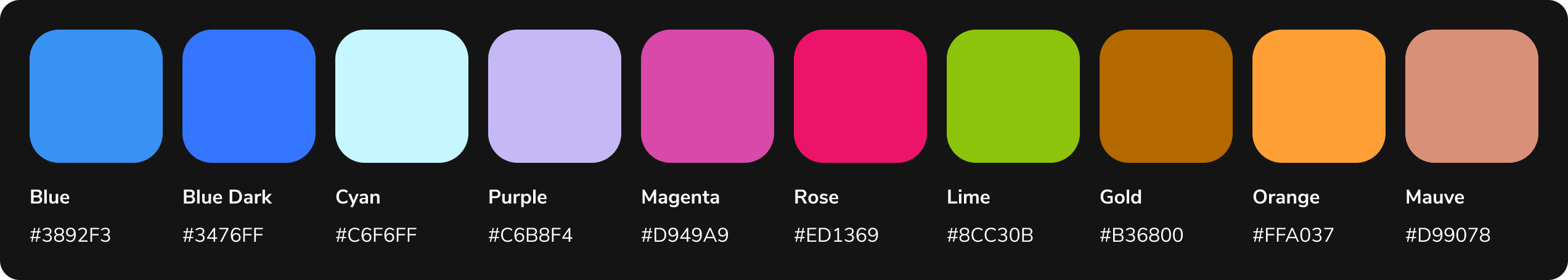
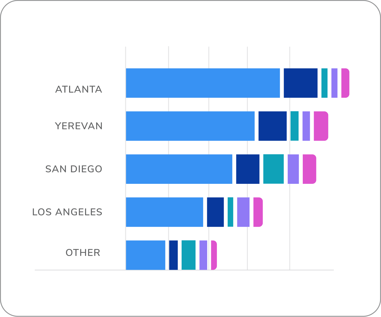
Our solution for visualizations with 5+ variables.
Utilize these colors in the order shown below. For example, the first 3
variables in your data set must use blue, cyan, and purple, for visual
consistency across the experience.Accessibility requirement: when using this palette, you must include a direct
labeling option on your visualization.