Getting Started
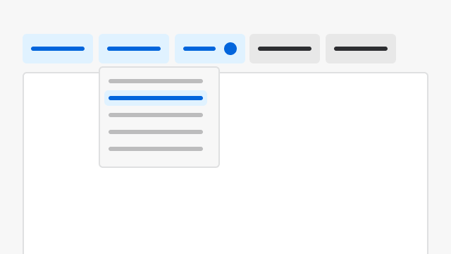
Filters are primarily built off the Filter Bar component. Refer to its documentation for design and implementation guidance.Principles
Smart, Insightful
The default filter behavior should be aligned with user preferences and common use cases. If a specific filter option is used by 80% of users, make that the default. Users will still have the flexibility to adjust, but the system nudges them towards efficient choices.Intuitive, Efficient, Automatic
- Most usable filters should always be placed first to ensure quick access, reduce user effort, and improve efficiency in finding relevant results.
- When filter patterns are consistent, users can easily locate the information they need and perform tasks with greater efficiency.
- Users don’t need to re-learn how to use filters repeatedly. If they know where to locate filters in one section of the application, they can quickly and conveniently locate them in other areas of the product.
- The usability of filter patterns is crucial for creating a positive user experience and increasing user engagement and satisfaction. Therefore, ST layout options, responsiveness, and page hierarchies (headers, action bars, etc.) should be considered when making a decision.