A Quick Guide
| Palette Type | Use When | Best for Chart Types |
|---|---|---|
| Monochrome default |
|
|
| Pattern |
|
|
| Categorical Palette |
|
|
| Semantic (Status) |
|
|
Color Palette
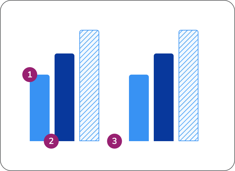
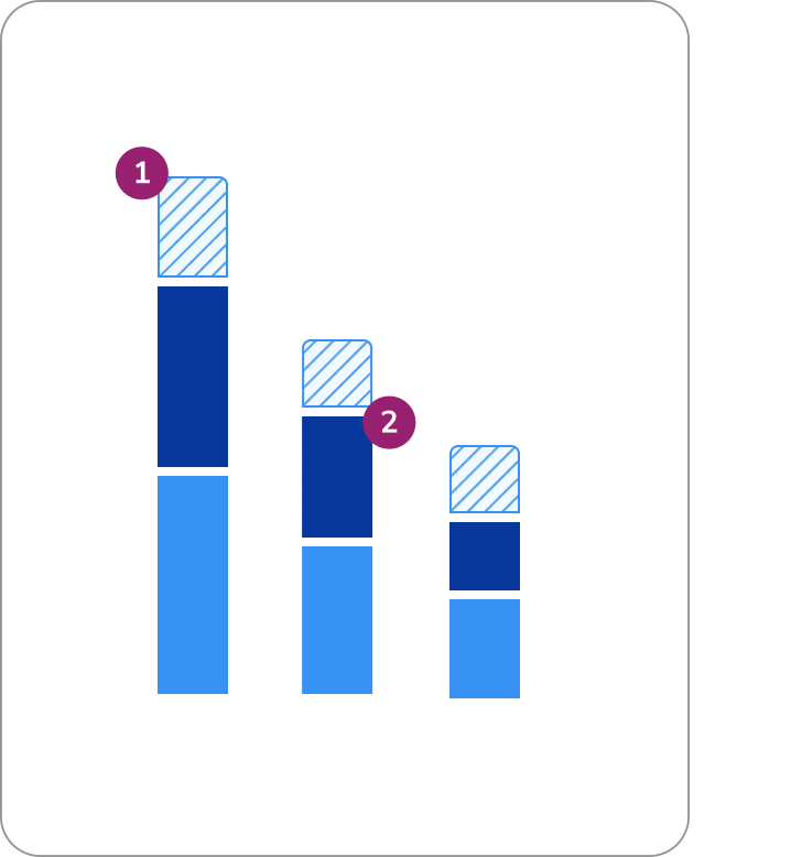
Utilize this monochrome palette in this specific order for charts with 4 variables or less.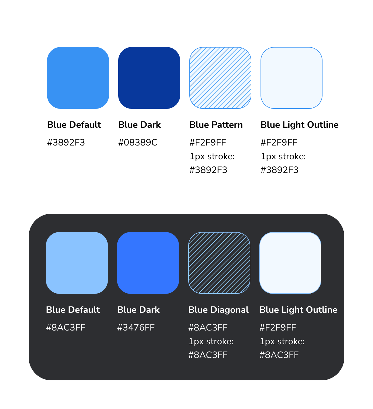
Variable Ordering
| 1 Variable | 2 Variables | 3 Variables | 4 Variables | 5+ Variables |
| If your chart has one variable, start with the default hue in the palette. | If your chart has two variables, use the default and dark blue. | If your chart has three variables, add the diagonal pattern. | If your chart has four variables, add the lightest blue with a stroke. | For five + variables, see our extended color palette. |
 |  |  |  |  |


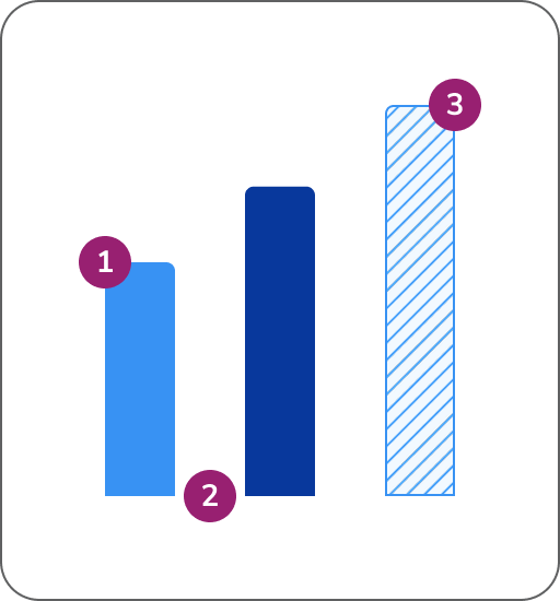
One Variable
Two Variables
When adding a 4th variable to a stacked bar chart, place it at the bottom to support visual accessibility and maintain consistency.
Three Variables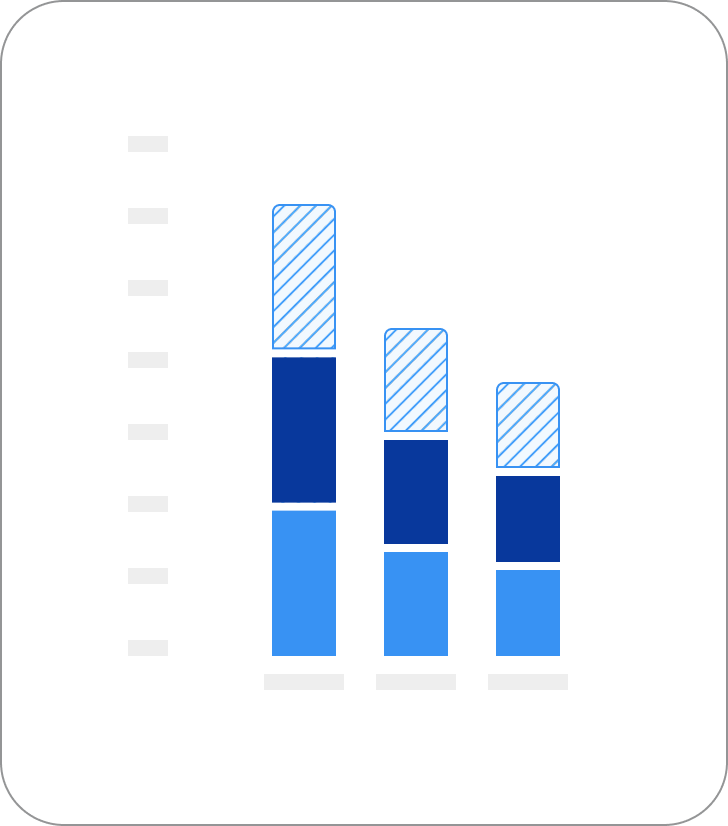
Four Variables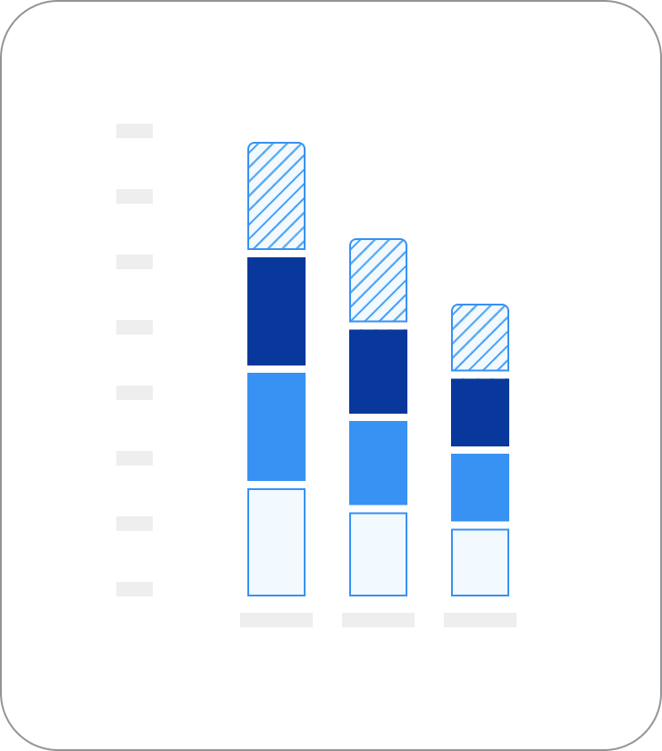
General Design Guidelines
Bar charts
- Top left and right corner: Border radius is 4px
- Space between bars: Space between bars should abide by Anvil spacing rules and be appropriate for the width of the total graph
- Stroke and pattern: The lightest color and pattern requires a 1px stroke for accessibility
Grouped bar charts
- General guidance from Bar Charts apply: See guidance above
- Space between bars: Space between bars should abide by Anvil spacing rules and be appropriate for the width of the total graph
- Space between sections: Space between bars should abide by Anvil spacing rules, should be larger than the space between bars, and be appropriate for the width of the total graph
Stacked bar charts
- General guidance from Bar Charts apply: See guidance above
- Space between sections: 4px spacing is recommended
Donut charts
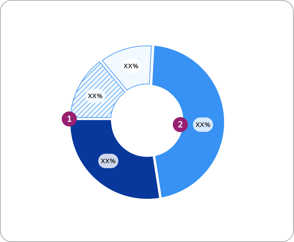
- Space between pie sections: 4px spacing is recommended
- Direct labeling: It’s best practice to have the value directly on the corresponding donut slice. If this is not possible, a hover state is required. More info on direct labeling here.
Real Example
The following is a possible real-world example. This example displays multiple datasets on a single page, including a donut chart, a single stacked bar chart, a horizontal bar graph, and a larger bar graph all utilizing our monochrome palette.
Questions? Challenges?
Contact the Visual Design team on the #ask-vizd channel